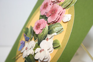
The flowers are placed on the card in 3D fashion. Since I wanted the flowers to be the spotlight of my card, I made a simple mat background using Spellbinders. The greeting is by Sweet and Sassy. As an added touch, I put two little stones on the greeting and a butterfly sticker on the flowers. Below are various views of the card. I hope you like it.
Tuesday, May 31, 2011
I'm So Pleased
I am so pleased with the way this card turned out. It uses a flower sheet from my sponsor of the current challenge, Our Daily Bread Designs. Besides stamps, ODBD offers numerous other products for card making and this is one of them.
Labels:
3D Flowers,
Our Daily Bread Designs,
Sweet and Sassy
Sunday, May 29, 2011
Challenge #18 - Color My World
I will be a little late posting the challenge winner for "Little Girls with Curls" as I had so many entries. I want to at least look at all of them even though I may not make a comment. I am so pleased that so many artists are particiipating in my challenges.
 Petra
Petra
This next challenge should be a great challenge. It is "Color My World". Here are some ideas, You may color your image, color your background, or airbrush your card; you may use markers, ink, chalk, paint, or pencils. The challenge is not limited to just these ideas. No particular brand is required for this challenge as we all have invested in different products. The only requirement is that your card or project is colorful and that you state what you used.
Here are some ideas from the design team. If you look closely you will see each of us has a different way of emphasizing color.
Vicki
I decided to go with basically a monochromatic color scheme. I chose a lavandar base card. On top of that I used a light purple. And on top of that I used a piece of dark colored cardstock on which I used the Technique Junkie technique embossed webbing. This is a fun and extremely easily technique. The hardest thing about it is finding a store that will carry the webbing paint.
My featured image is a Magnolia stamp. I colored her with Copic markers, the sponsor for this challenge. A sheer piece of ribbon is added for my embellishment as I didn't want to overshadow the background paper.
 Petra
PetraIt feels like going back to my childhood sitting with colouring books for hours, filling the pages with scribbles and ... colour! Little did I know about the colourful world of the Mandalas at the time. I adore these vibrant circles and their manifold patterns. My Mandala image is from one of the free colouring pages for children. I printed it twice, one slightly larger. The smaller circle is coloured with Copics and layered on the second slightly larger circle which I left uncoloured. The base is a plain white card and some embossed and inked Kraftcard (Tim Holtz texture folder and Distress ink Walnut Stain). The Mandala is mounted onto the base with foam pads. The finishing touches are some button twine, a stamped sentiment (Hero Arts) and a little gem.
Barbara

When I found out the theme for this challenge I immediately thought of my EarthArt International images and my Copics. The EarthArt International images represent the animal spirits and are inspired by nature. It's amazing to examine the images because within the animal itself are so many other images from nature. If you look closely at the moose, you might see an owl, a butterfly, many leaves, a racoon, a leapard, flowers, snakes, raindrops and clouds, a lizard, a ladybug, and different animal skin patterns. It was so much fun to color the moose (with my Copics) because I kept discovering the different images. The background of my card was a piece of design paper. It was printed with pale leaves. I used my Copics to change the colors and used the blender to give them a more watercolored look. Using Versafine, I stamped a marble background stamp over the entire background. It is more like a watermark. I thought the sentiment from Stampscapes was perfect for both the challenge and the image. Now I can't wait to see what you share with us.

Krisha

Michele
Sometimes you can stick Mr. Mojo in a box and close the lid, because things just fall into place by themselves! When Vicki sent me this challenge I already had this image colored and stored in my "ready to go images" (yes I have a stash of these, from times I just want to color and do nothing else LOL) So I did a few touch ups, trimmed him out and found this background paper, that I have had stashed for years and completed the card. I don't know who the image is from, he came through an image swap and I just love him. Wish I had the stamp!

Michele
There's nothing like coloring! One reason I fell in love with stamping was the way it reminds me of being with my coloring books as a little girl. Actually I still have coloring books! Sweet pea stamps offer a great basis for coloring fun. My stamp here is a Ching Chou Kuik design called Hummingbird. I colored it with colored pencils then cut it out and placed it on a background done with the antiqued glimmers technique from Technique Junkies. That background was adhered to some lovely shiny paper from The Paper Temptress. I finished it off with some flowers cut from a punch and I put some little shiny colorful dots in the flowers. I hope you have fun coloring!
When I think of "color" I personally think of Copic Markers. Copic Markers are Awesome.
Copic has everything you need; they offer a versatile selection and are designed to be the highest quality available. With markers in over 300 colors, ink pens, a marker compatible airbrush system, paper, and books – Copic has it all.
This company with wonderful alcohol-based markers is my sponsor for this colorful challenge.
Labels:
Challenge #18 "Color My World",
Copics,
Design Team
Saturday, May 28, 2011
Girl with Roses
Here is a card I made while straightening my desk today. (This is why my desk never really gets straight). The main image is from DigiDarla. She is having her first challenge with a giveaway. Everyone who joins in her challenge gets a free digital.
The background has an embossed webbing technique and the beautiful gold cardstock behind the image is from Paper Temptress. As an added touch I use some 3D flowers which I had and a couple of brass button. The image is colored with Copics.
I hope everyone has a safe and enjoyable Memorial Holiday. Now back to clean my desk!
Labels:
Copics DigiDarla,
Embossed Webbing,
Paper Temptress
Wednesday, May 25, 2011
Travel Bookmarks
I have finally finished my Travel-themed bookmarks. They are for the Gingersnap Creations' bookmark swap. They were fun to do even though at first I didn't think I had stamps that were appropriate. I made bookmarks for four different places. They are the following: 1-USA, Music City (Nashville, TN), 2-Holland, 3-Paris and 4-Japan.
I will be sending them out tomorrow. I look forward to receiving my four from the swap and see the places they represent.
I will be sending them out tomorrow. I look forward to receiving my four from the swap and see the places they represent.
Monday, May 23, 2011
Just Another Post
Here is a card that I have never posted and another tag. The card uses the Millieflori technique for the background. The image is from Twisted Papers.
The tag uses a image from a Gecko Galz. The greeting is made with two word beads. The background color was done with chalk. The scroll is made with rhinestones.
Sunday, May 22, 2011
Look at the Color!
You have a week left to enter this colorful challenge. You can create anything you wish as long as it is colorful. Take a peek at some more inspiration for this challenge.
Vicki
Since my challenge is being sponsored by Copic, I decided to use them in a different manner this time. I use the markers to airbrush the background of my tag. The flowers and greeting are by Stampin' Up. I used Memories Artprint Brown ink to stamp the images. After that I added two colorful butterfly stickers and a scrap piece of red rafia and my tag was finished.
This reminds me of a glorious sunset in a field of flowers. Aren't you glad God gave us color?
Michele
This is my colorful bonanza card! I wanted to try coloring on a background that was already colorful. So I started with a piece of card stock that I'd saturated with watercolor jewels from Zia Stamps in multiple shades of blue. I stamped a Sweet Pea Stamp, another image by Ching Chou Kuik, this one is called "Dance of Butterfly." I liked the idea of stamping the mermaid on a blue background. She is colored with colored pencils -- I used just about every color that I have! I cut that image and attached it to some yellowish card stock. The card that serves as a base for everything was also heavily colored by me, but with several colors of starburst stains. I chose the pale green ribbon to make a border on the diagonal ends because it reminded me of seaweed. Enjoy and keep coloring! Petra
PetraThe sun is shining, the birds are singing and the garden is brimming with colour and so are the papers from Cosmo Cricket. Every time I look at them I have to smile. I layered the papers, punched (Stampin' Up edge punch) and machine-stitched them and mounted them onto a plain square card and Bazill Basics paper. The stamped images are from Elzybells and coloured with Copics and Koh-i-noors. The little canvas is paper-pieced with Cosmo Cricket paper and the image layer also machine-stitched around the edges. The final touches are some ribbon and little buttons from my stash.
A Sad Goodbye
It is with sadness that I announce that Krisha Ogle has had to resign from my Design Team. I will miss having her creatons on my blog, but I wish her well in whatever projects she decides to do. I will continue to follow her on her blog. Below is a final creation from Krisha.


Krisha
My tag is really a laminate sample of a wood grain that is 3 1/2" x 6", they are the greatest "tags" to work with! I started playing with some inks to darken and age it, then chose to just use black ink for the images. I did add a very old postage stamp and a wooden flower I found at the Dollar Store. A jute tie finished it off.
Images are from: Rouge Redheads, Tim Holtz, Inkadinkado,Studio G and PSX
Saturday, May 21, 2011
Looking Good-Both Ways
Here is a card I did with a big flap that I think looks good both ways. When you make a comment tell which wasy you like it...The first is potrait. The second is landscape.
I chose red and gold so I could enter Gingersnap Creations' GC100 Color Challenge of red and gold. The background of the card was done with the Highlighted Cuttlebug technique. I used a gold pen to do the highlighting. The image is a Darla Digi and I think it looks great going either way. Coloring was done with Copic markers. Finishing up the card is a scrap piece of red and gold ribbon. I also entered this is Darla's first challenge "Mother's Day" (flowers).
Friday, May 20, 2011
Congratulations
Congratulations to Kerry Kung for being the winner of Challenge #17. My random generator picked #35 this week. Kerry's entry has the place of honor at the top of my sidebar for two weeks.
There were so many wonderful entries and I really appreciate the response I have been having to my challenges lately. I hope everyone is enjoying the themes I have picked. There are more to come. If you would like to see a particular challenge, just let me know as I am open for ideas.
There were so many wonderful entries and I really appreciate the response I have been having to my challenges lately. I hope everyone is enjoying the themes I have picked. There are more to come. If you would like to see a particular challenge, just let me know as I am open for ideas.
Tuesday, May 17, 2011
I Love My Mailman
Look at the beautiful stash that I received via my mailman today from Valerie at Bastelmania. She was celebrating 100 followers and over 50,000 visitors. I happen to be one of the lucky people to receive some of the stash.
I have had a blast just looking through it and can't wait to start using it. Thanks Valerie, I will be in the clouds using all of these goodies.
Not only did I get all these beautiful papers and embellishments, it came in an art envelope. My maulman was fascinated as well I with the beautiful envelope. Look at all the beauriful work on this envelope.
Sunday, May 15, 2011
Challenge #17- "Little Girls with Curls"
After using the "men" theme, let's turn our attention to the feminine side. The theme for the next two weeks is "Little Girls with Curls". I would love to have you enter. You have 2 weeks to enter as the challenge ends May 15th at midnight.
Hopefully, you will be inspired with the following samples.


My sponsor for this challenge is Mo's Digital Pencil. Maurie J Manning has been an author and illustrator for children's book for about 12 years. Her digitals are delightful. Each "person" she draws has a distinctive personalty through her drawings. She maintains a gallery on Facebook where artists can enter their work using her images. Take a peak at her new site. Click on her banner above as it will take you to her store. You will not be disappointed in her site.
I sincerely thank Mo for sponsoring this challenge.
Hopefully, you will be inspired with the following samples.
Vicki
My card shows the type of "curls" my daughters had....none. I kept hoping, but even now with their being grown, they still have straight hair. The reason I picked this cute little girl as she is from my sponsor, Mo's Digital Pencil. The image is colored with Copics and the background is a TJ technique, Textured Tape. The greeting is computer generated.
Barbara
I'm about to show my age with my card this time because as soon as I heard the challenge Girls With Curls I immediately thought of Shirley Temple. Now I can't get the song "On the Good Ship Lollipop" out of my head. I remember watching Shirley Temple movies when I was a child and thinking how cute she was. I kept my card in black in white to go with the times of her movies. I added the pink roses just as a contrast. Shirley's image is a Stampsmith stamp.

Petra
I've had this little image from Magic Moonlight Free images in my folder for quite a while and as soon as Vicki announced the theme I knew it would be perfect for the challenge. This time I created a tag using Prima patterend paper as base for the tag. The young lady with the curly hair is well protected behind clear vellum which is machine stitched to the base. It gave a very nice little pocket so I couldn't resist and filled the vellum pocket with some micre beads. The sentiment stamp is from Kaisercraft and ribbon from my stash.
Michele
Curly hair is a wonderful thing. I pulled out all of my stamps that featured curly-haired girls and decided to use the wonderful lady blowing a kiss from Leavenworth Jackson and and the sweet clown girl from Character Constructions. My background is a Technique Junkies technique called "marbled smoosh." The stamped images were stamped on colorful blue paper from the Paper Temptress. I glued the kissing lady on to a butterfly embellishment to give her wings and otherwise embellished everything else with flowers and stickers. Celebrate your curls!

Krisha
My Mojo just wasn't into layers and such, when I sat down to make a card for this challenge, so it became an even bigger challenge! Going back to "old school" I did my stamping right onto the card, then colored with pencil and with markers. I added small silk flowers and rhinestones to finish it off. Stamping directly on the card is something I haven't done in years, and forgotten the difficulties of doing this.
Imaginations and Inkadinkado provided the images.
I sincerely thank Mo for sponsoring this challenge.
Wednesday, May 11, 2011
Two in One
This is the second post for today. My first post was the precious card created by Petra. This time I am posting two of my cards
This little girl image is by Magnolia. She is colored with Copics. As an added touch I made a lace ruffle for the card highlighted with a silk flower which I took apart and put back together with a stone brad.
Recently I made a number of papers using the Embossed Webbing technique. I will be using these as background papers in the near future. Some of them had thick webbing while others had fine webbing. This card uses one of the papers using thick webbing in the Embossed Webbing . The image is by Mo's Digital Pencil. It has been put on a dark blue shadow. The flower is a single silk flower and the verse is from Quote Garden. The greeting says "The Rose Bowl is the only bowl I have seen that I didn't have to clean." by Erma Bombeck.
Thursday, May 5, 2011
Oops!
I almost forgot to pick the winner of "There is a Man in My Life" It is #15 Karin Martin. She was picked by random generator. Congratulations Karin.
Sunday, May 1, 2011
Challenge # 16 - There is a Man in My Life
This week I am focusing on men, yes men. The challenge this week is "There is a Man in my Life". You can make a card, tag, etc. for a man or one with a man- young or old- on your project.. I would love to see what you create keeping this theme in mind.
My sponsor for this challenge is Moonlight Journey. Oh, they have so many great digitals. You will have to go to their site and check it out. There are women, men, doors, butterflies, castles and the list goes on. The next couple of days I will be posting a number of their digitals as I personally have quite a few of them.
Below you will see some of the projects the DT has created to give your inspiration.

 Petra
Petra
Moonlight Journey
My sponsor for this challenge is Moonlight Journey. Oh, they have so many great digitals. You will have to go to their site and check it out. There are women, men, doors, butterflies, castles and the list goes on. The next couple of days I will be posting a number of their digitals as I personally have quite a few of them.
Below you will see some of the projects the DT has created to give your inspiration.
Vicki
My card uses images from Moonlight Journey, the sponsor for this challenge. The background is Distressed Glue, a Technique Junkie technique. This is a very easy technique, but you have to have patience while everything dries. I took a sponge that had been used with distressed ink and tinted my greeting as well as the face and hands of the image as I didn't like the stark white of the man's face and hands.
I am also entering this card in Gingersnap Creations' GC 96 Ginger, Copper and Rust.
I am also entering this card in Gingersnap Creations' GC 96 Ginger, Copper and Rust.
Barbara Washington
My card also uses digital images from Moonlight Journey. The background is from Steampunk Backgrounds and the man and the words are from Masterful Men Tags. Only the hat is not from Moonlight Journey. I had one of those happy accidents as I was starting this card. When I went to print the images, I didn't realize that I had photo paper in the printer and I printed out the images. Normally I would have used plain cardstock. I really liked how the images looked like photos, so I used them. The balloon was printed twice. I cut out the balloon, rounded it with a paper rounder and used hot glue to attach it and give it dimension. The big clock, spinner, and gear are from the Tim Holtz Idea-ology line. The little gears are actual watch parts that I had in my stash. I love doing Steampunk art and I think it makes great man cards.

Krisha
Using Tom Holtz stamps I created this card for my youngest son's birthday ( April 15) It is a cream colored card that has been dry embossed on the front cover. The can and the sentiment were stamped then trimmed. The sentiment is mounted onto a thin cork and gold paper. The time piece is stamped onto the hand made paper layer, and clock face and gold corner charm were the finishing touches.
 Petra
PetraLittle men - big men ... it never seems to be so easy to make cards for either! The card is based on a sketch from Mojo Monday. I used Basic Grey papers for covering the square white card. The top of the second layer has been punched with an EKSuccess punch and has been embellished with machine-sewn lines. The stamped images are from Lily of the Valley and coloured with Copics and Koh-i-noor pencils. Buttons and thread are from my stash. Wishing you all lots of sunshine!
Michele
I'm definitely one of those folks who is challenged when it comes time to make cards for men. I don't exactly know why this is -- and I could get philosophical about it but I'll save that for another time... Anyway I have it in my head that I should keep cards for men more simple. And I like simplicity so that was the inspiration for this card. The main image is a Louis Armstrong stamp from the Stampsmith. I applied markers directly to the stamp. I cut out my image at an angle, drew a dark brown border on that with another marker and then attached it to some designer paper. I then attached that to the brown card stock. I thought about putting a saying on it but I opted to keep with the simple theme. I'd be happy to give this to any man in my life!
Subscribe to:
Comments (Atom)


